Charts in Excel is a one-stop solution to all business intelligence-related problems. Using the charts in Excel, BI experts get insights from the data and present the same in the simplest and most understandable form. This tutorial will help you understand the fundamental and most frequently used Charts in Excel.
Pie Charts in Excel
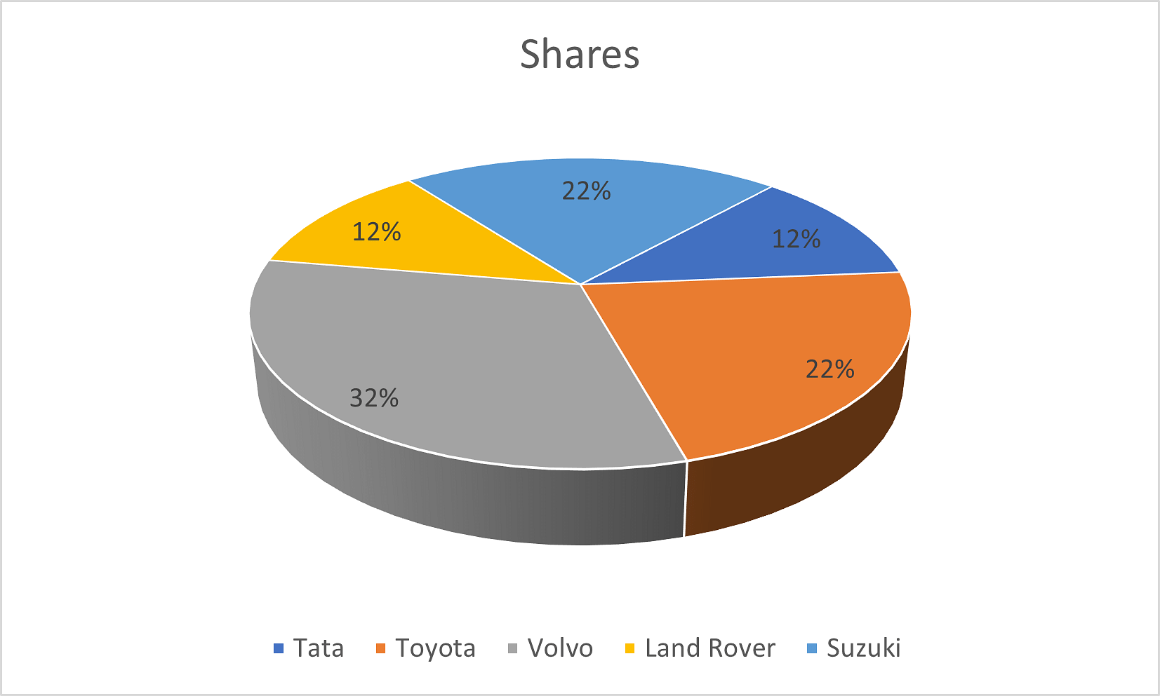
Pie Charts in Excel are one of the simplest to create. It is popular for being the most visually appealing charts that represent information during a presentation. You can use the automobile data to find out the market shares of each company using the pie chart in Excel.
To create a pie chart, you need to select your entire data.
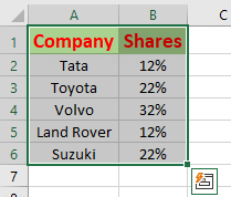
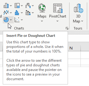
Then, navigate through the toolbar, select the insert option, and select the pie-chart icon/option shown below.
In the pie-chart drop-down menu, Microsoft Excel will provide you with a variety of options.
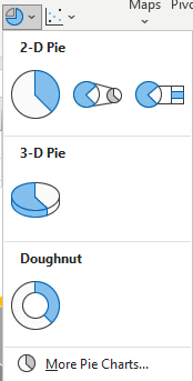
For now, select a three-dimensional pie-chart and it looks as follows.
Moving ahead, you will learn about column charts in Excel
Column Charts in Excel
Column Charts in Excel are the quickest to create. To create a column chart, you can use the shortcut key. Now, you will look into the step-by-step method to create a column chart in Excel.
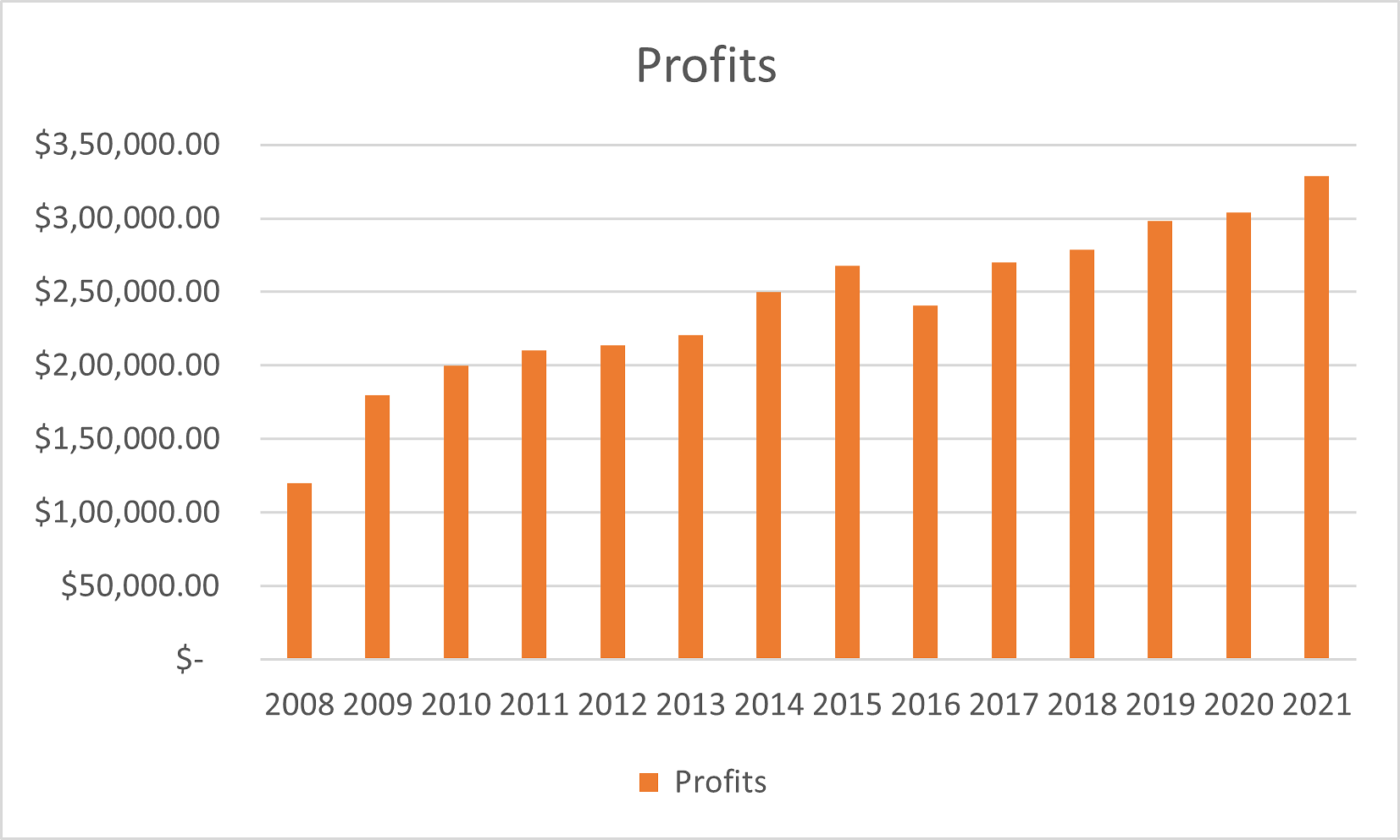
Here, you will use the year-on-year profits data and visualize the annual profits using a column chart.
Select the obtained data as shown below.
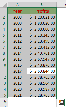
Next, press the function key F11. Then, MS Excel will automatically create a column chart as shown below.
Bar Charts in Excel
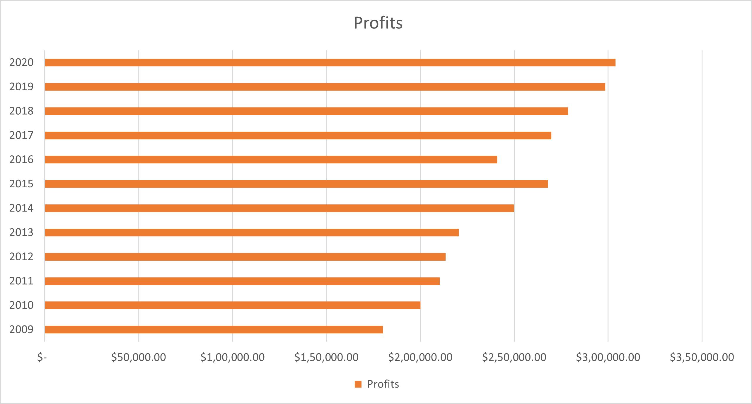
Bar Charts in Excel are simply the column charts represented horizontally. You can convert the column chart into a bar chart by following some simple steps as shown below.
Here, use the year-on-year profits data and visualize the annual profits using a bar chart.
Select the data on your Excel Sheet and use the shortcut method (Press Function key F11) to create the regular column chart.
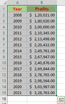
After creating the regular column chart, right-click on the chart area and select the option of change chart type.
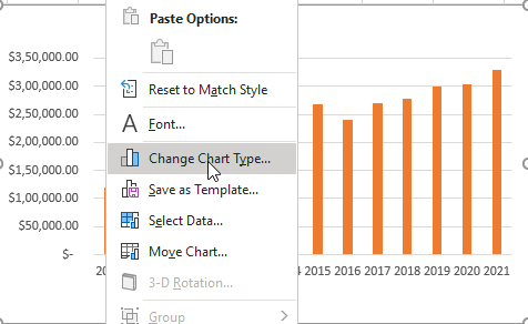
In the change chart type option, you will find a set of chart options that include a variety of charts, as shown below.
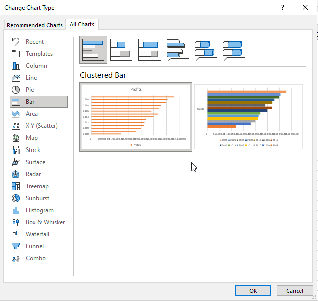
In the available chart options, select the bar graph option and the resultant chart will be transformed as follows.
Moving ahead, you will go through the difference between Column vs. Line Charts in Excel
Column vs. Line Charts in Excel
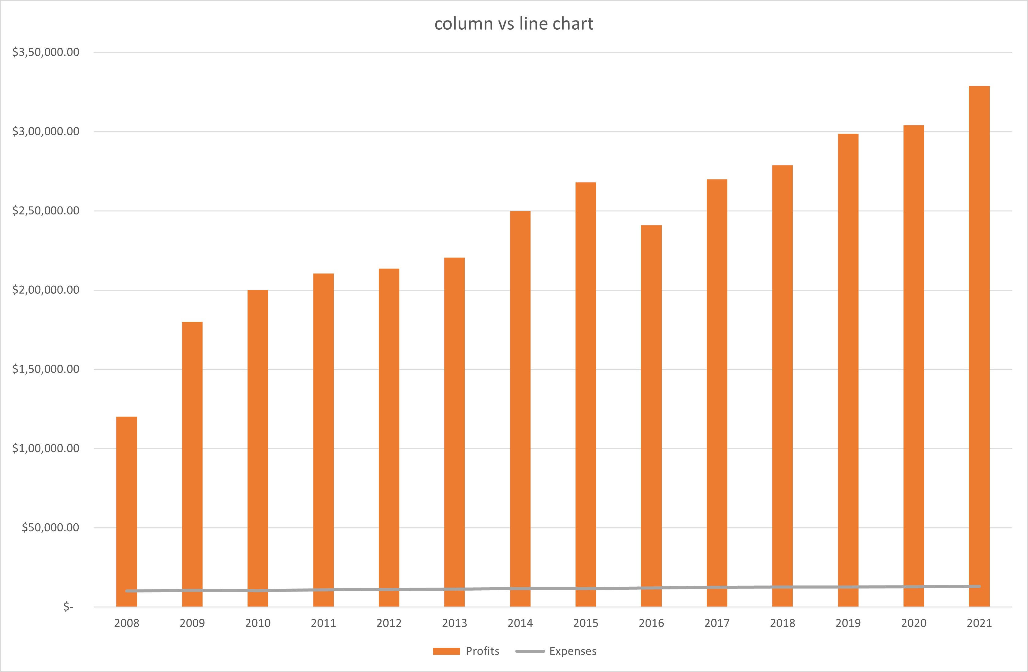
Column vs. Line Charts in Excel is used to analyze the variations of two or more elements simultaneously. To create a column vs. line chart, you need to implement the following steps.
You can use the year-on-year profits versus expenses data, and visualize the annual profits versus the expenses using a column vs. line chart, where the columns will show the profits and the line will represent the expenses.
Select the entire data and use the shortcut key F1 to create a column chart. The resultant column chart will appear as follows.
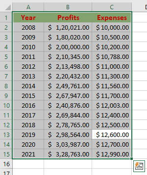
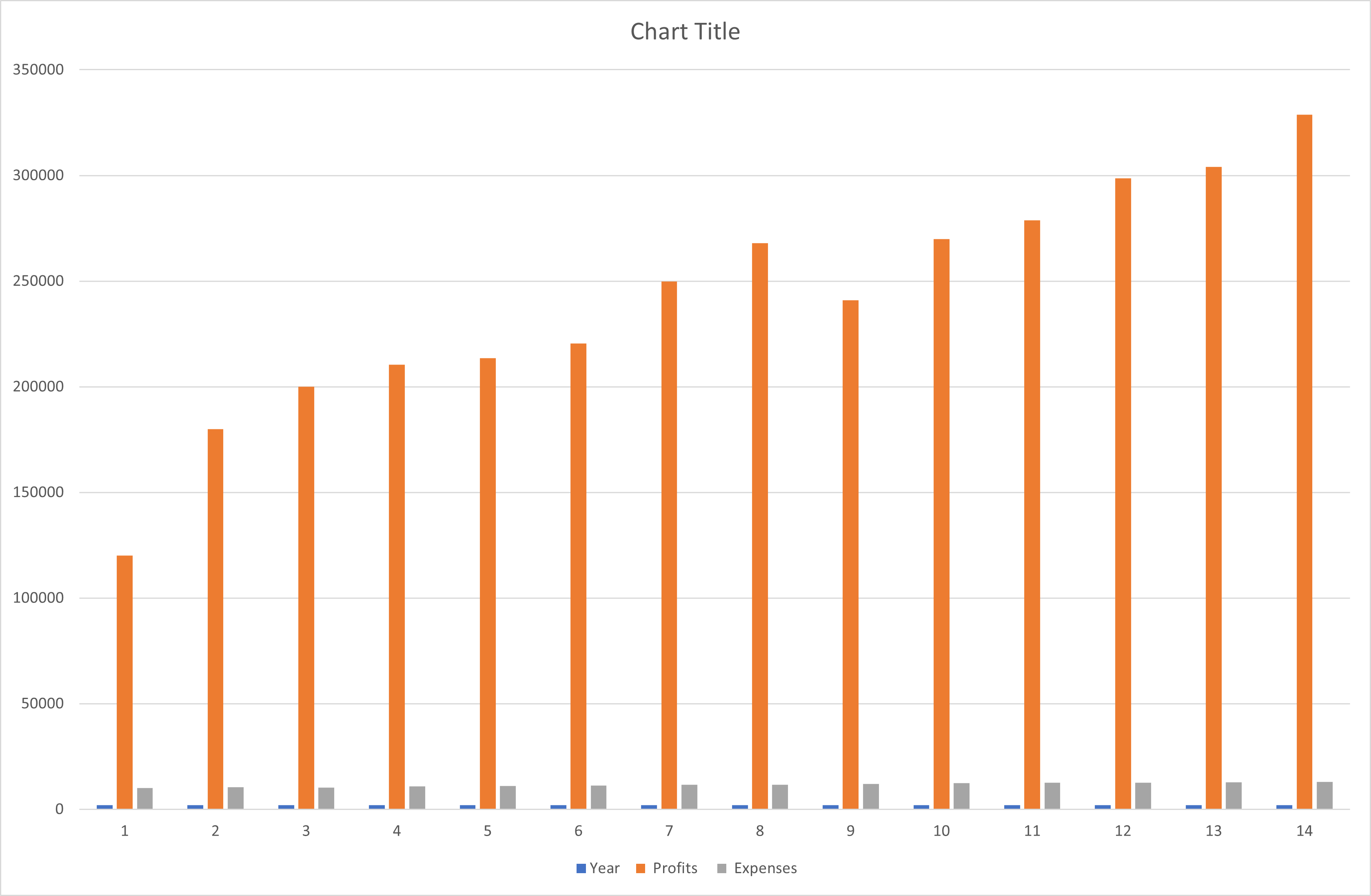
Now, you need to create the column vs. line chart. So for that, you need to change the chart type. For that, right-click on the chart area and select the chart type option.
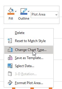
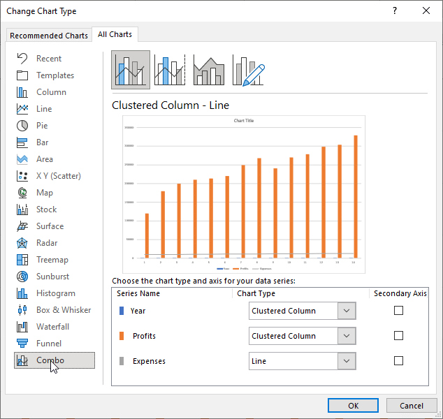
In the chart type window, select the combo option and select the column and line combo option. And it will transform the chart into a column vs. line chart, as shown below.
Next, you will continue with pivot charts in Excel.
Pivot Charts in Excel
A Pivot Chart is considered as a real-time interactive chart that responds to the variations happenings in the real-time data. To create a pivot chart, you need to follow the steps mentioned below.
You must use the automakers and distributors data and visualize the sales happening in different regions using a pivot chart
Select the data available on your Excel sheet as shown below.

Now, select the insert option from the toolbar and the ribbon, choose the pivot chart option as shown below.

After you select the pivot chart option, you will have a new dialogue box where you select the range and the location of the chart. Here, you must choose the complete data for the range and select a location for the chart in the current worksheet.
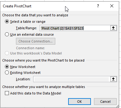
Now, you have a newly created an empty pivot chart on the screen as shown below.
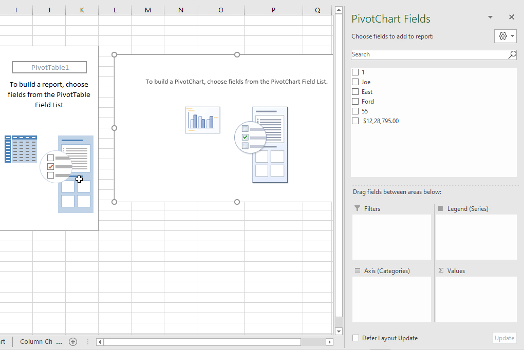
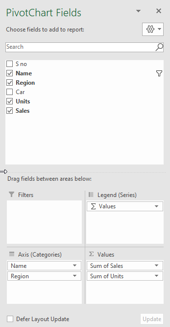
Now, select the elements for the chart as shown below, and try to extract the insights from the form of an interactive pivot chart.
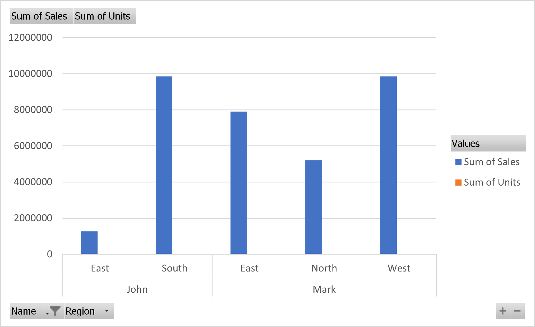
The resultant pivot chart will look as follows.
In the next part, you will learn the sparkline charts in Excel.
Sparkline Charts in Excel
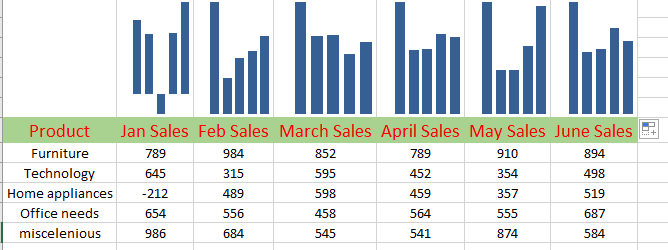
Sparkline Charts in Excel are tiny cells that represent the insights of the respective columns. To create a sparkline chart in Excel, you need to follow the steps provided below.
Use the store data and visualize the monthly sales using a sparkline chart.
Select the insert option from the toolbar and select the sparkline option from the ribbon as shown below.

Now, select the data from the column as shown below.

Now, select the type of sparkline chart you wish to create. For now, you must select the column type of sparkline chart.
A new dialogue box will appear that asks you for the location of the column type sparkline chart.
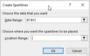
Select the location and press ok. It will create the sparkline chart and you can simply drag the cell across all the columns to create a column chart for all the columns in the table as shown below.
With that, you have reached the end of this tutorial on Charts in Excel.
Gain expertise in the latest Business analytics tools and techniques with the Business Analyst Master's Program. Enroll now!
Next Steps
"Calculate Percentage in Excel" can be your next stop. Calculating Percentage in Microsoft Excel can enable you to perform the modulus-related operations on your data with ease.
Interested in learning more about Business Analytics?
Simplilearn offers career-oriented online training and certification in Business Analytics certification. This training is designed to enlighten you with the fundamental concepts of data analysis and statistics. After the course, you will be able to devise insights from available data to present your findings using executive-level dashboards and to help you come up with data-driven decision-making.
Have any questions for us? Please feel free to let us know in the comments section below and our team of experts will be happy to resolve all your queries.

