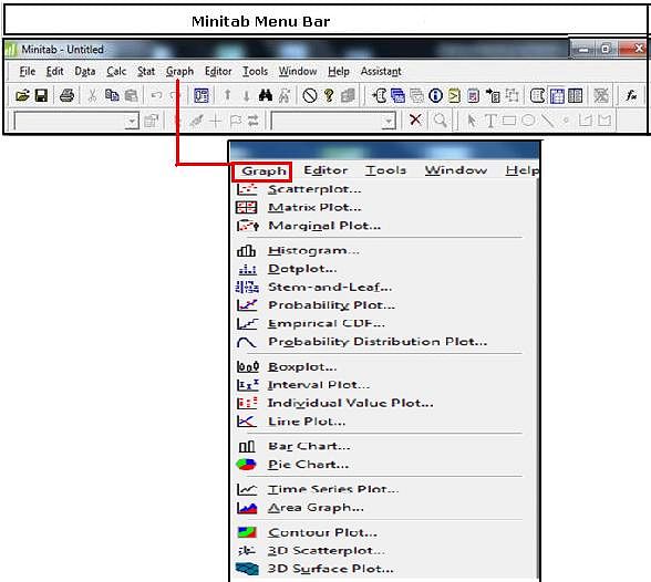
The Graph Menu in Minitab Menu Bar involves creating the common Graphs required for analysis and representation of data. There are various commands and functions coming within Graph Menu that plays an important role in statistical applications and calculation. Anyone looking forward towards learning in Minitab needs to have in depth knowledge on each concept. Let’s discuss about the commands and functions of the Graph Menu in Minitab Menu bar.
- Scatterplot: This command is used to illustrate the relationship between two variables by plotting one against the other
- Matrix Plot: This command assess the relationships between many pairs of variables at once by creating an array of scatterplots
- Marginal Plot: This command is used to assess the relationship between two variables and examine their distributions
- Histogram: This command is used to examine the shape and spread of sample data. Histograms divide sample values into many intervals called bins
- Dotplot: This command is used to assess and compare distributions by plotting the values along a number line. Dotplots are especially useful for comparing distributions.
- Stem-and-Leaf: This command is used to examine the shape and spread of sample data.
- Probability Plot: This command is used to help you determine whether a particular distribution fits your data or to compare different sample distributions
- Empirical CDF: The empirical cumulative distribution function is used to evaluate the fit of a distribution to your data or to compare different sample distributions.
- Probability Distribution Plot: This function is used to view and compare the shape of distribution curves and to view areas under distribution curves corresponding to either probabilities or data values.
- Boxplot: This command is used to assess and compare sample distributions.
- Interval Plot: This is used to plot means and either confidence intervals or error bars for one or more variables.
- Individual Value Plot: This command is used to assess and compare sample distributions by plotting individual values for each variable or group in a vertical column, making it easy to spot outliers and see the distribution.
- Line Plot: This is used to graphically compare response patterns for two or more groups.
- Bar Chart: This is used to compare some measure of data categories. Each bar can represent a count of a category, a function of a category, or summary values from a table.
- Pie Chart: This command is used to display the proportion of each data category relative to the whole data set.
- Time Series Plot: This function is used to evaluate patterns in data over time.
- Area Graph: This is used to evaluate trends in multiple time series as well as each series' contribution to the sum.
- Contour Plot: This is used for contour plot.
- 3D Surface Plot: This is used to evaluate relationships between three variables at once
- 3D Scatterplot: This command is used to evaluate relationships between three variables at once by plotting data on three axes.
To know more about Graph Menu, you can explore our training courses on Minitab training.

